What is color analysis, and how does it work?
Color analysis is the practice of finding the colors that harmonize with your natural skin, hair and eye coloring, so that what you wear makes your face look even and awake instead of tired. This page explains what it measures, how the 12 seasons are built, what happens in a professional session, how to do a rough version on yourself at home, and how a photo-based reading does it, including the part a camera gets wrong.
By Ruslan ShchuchkinML engineer and data scientistUpdated
What personal color analysis is
Personal color analysis (also called seasonal color analysis) is a method for identifying the colors that harmonize with your natural coloring, the undertone of your skin, the depth of your hair and eyes, and how clear or muted the three are together. The modern system sorts people into 12 seasons, three in each of Spring, Summer, Autumn and Winter, and gives each season a palette of colors that share its undertone, depth and clarity. Colors from your own palette make your skin look even, your eyes look brighter and the shadows under them lighter; colors that fight it deepen those shadows and make skin look sallow, grey or flushed.
The idea is older than the seasons. Painters have known for centuries that a color looks different next to every other color, and that a face is just a set of colors that everything around it is being compared to. The four-season version was popularized in the 1980s; the 12-season version most analysts work in today came out of the 1990s and 2000s, when it became obvious that four buckets were not enough. What has not changed is the point of the exercise: you are not being told what is pretty, you are being told what your own coloring already agrees with.
That last distinction matters. The colors that suit you are the ones you were born with. A color analysis does not invent a look; it names the one your skin, hair and eyes have been quietly asking for. This is why the result feels obvious in hindsight to most people, and why it holds: undertone does not change, and the rest drifts slowly.
The three axes: undertone, depth and clarity
Every season in the 12-tone system is a position on three scales, and so are you. The analysis is the job of finding where you sit on each and picking the season closest to that point.
- Undertone (cool ↔ warm). The hue of your skin underneath its surface color, golden, peachy or olive on the warm side; pink, rosy or blue-ish on the cool side. This is the axis that eliminates the most seasons at once, and the one that is hardest to judge by eye and hardest for a camera to measure, because lighting shifts it.
- Depth (deep ↔ light). How light or deep your coloring is overall, hair, eyes and skin together. Very fair hair with light eyes sits at the light end; near-black hair with dark eyes sits at the deep end. A photo measures this well, because lightness survives almost any lighting.
- Clarity (soft ↔ bright). How clear or muted your coloring is. High-clarity coloring has strong contrast between hair, skin and eyes and looks right in saturated color; low-clarity coloring is blended and greyed, and a saturated color wears the person rather than the other way around.
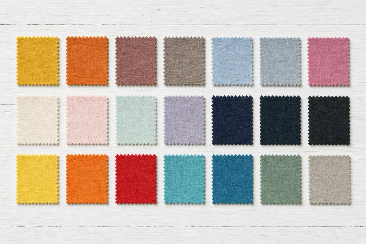
Each season has one axis it is defined by, the one that sits furthest from center and that the palette is built around. Bright Winter, for instance, is moderately cool, moderately deep and strongly bright; its defining axis is clarity, and its palette is chosen for that before anything else. Soft Summer is moderately cool, medium in depth and strongly soft, defined by clarity. When a measured position falls between two seasons, the nearest one wins, and an honest analysis tells you how close the runner-up was.
The 12 color seasons
Four families, each split three ways by whichever axis dominates. Every position below is the one the analysis engine actually scores against.
The families are the old four seasons and each one shares a trait. Within a family, the three seasons are named for what defines them: a True season is the purest example of the family’s undertone, a Light or Deep season is defined by depth, and a Bright or Soft season is defined by clarity. Each Light, Deep, Bright and Soft season also borders one season in the neighboring family, which is where most of the borderline results live.
Spring, warm and bright
- Light Spring, warm, strongly light and moderately bright. Defined by depth.
- True Spring, strongly warm, moderately light and bright. Defined by undertone.
- Bright Spring, moderately warm, moderately light and strongly bright. Defined by clarity.
Summer, cool and soft
- Light Summer, cool, strongly light and moderately soft. Defined by depth.
- True Summer, strongly cool, moderately light and moderately soft. Defined by undertone.
- Soft Summer, moderately cool, medium in depth and strongly soft. Defined by clarity.
Autumn, warm and soft
- Soft Autumn, moderately warm, medium in depth and strongly soft. Defined by clarity.
- True Autumn, strongly warm, medium in depth and moderately soft. Defined by undertone.
- Deep Autumn, warm, strongly deep and balanced in clarity. Defined by depth.
Winter, cool and bright
- Deep Winter, moderately cool, strongly deep and moderately bright. Defined by depth.
- True Winter, strongly cool, moderately deep and bright. Defined by undertone.
- Bright Winter, moderately cool, moderately deep and strongly bright. Defined by clarity.
Each season’s page carries its full palette with hex codes, its neutrals, the colors to avoid and why, and the hair and makeup shades that agree with it. The overview of all twelve shows the palettes side by side.
How a professional color analysis session works
An in-person analysis is draping, and the setup is most of the method. You sit facing a window in indirect daylight, with your makeup off and your hair covered or pulled back, in a grey or white cape that hides your clothes so nothing competes with your face. Overhead bulbs are switched off, because warm domestic light adds yellow to everything and fluorescent light adds green, either one undoes the thing you are paying for. Then the analyst holds lengths of fabric under your chin, usually in pairs, and watches your face rather than the fabric.

What she is watching for is specific. Under a color that agrees with you, the skin looks even and the shadows under the eyes and beside the nose lighten; the jawline reads clearly and the eyes look brighter. Under a color that fights you, the same shadows deepen, redness or sallowness comes forward, the face looks flatter and the fabric is what you notice. Neither reaction is subtle once you have seen it side by side, which is why the drapes are held in pairs.
The order of elimination is fixed, because each step halves the field:
- Warm against cool. A clearly warm drape (a rust, a golden yellow) against a clearly cool one (a fuchsia, an icy blue). This alone rules out half of the seasons, and it is the step a trained eye does best.
- Light against deep. Within the surviving half, a pale drape against a dark one in the same undertone. Does the pale one wash you out, or does the dark one swallow you?
- Bright against muted. A saturated drape against a dusty one, same undertone and depth. This is the axis the four-season system never tested, and it is why so many people were told they were a Winter in the 1980s and never felt it.
By the end you are down to one season, or to two neighbors that the analyst then tests directly against each other. You usually leave with a fan of fabric swatches or a printed card, sometimes a short list of makeup shades, and a person to ask about the coat you have never worn. A session takes one to two hours and costs $150–$500 in the US; the page on finding one near you covers what to ask before you book.
This is the gold standard, and nothing on a screen fully replaces it. Fabric against a real face in real daylight is the best test of undertone there is, and the borderline cases, where your position falls between two seasons, are exactly what a person holding two drapes resolves best.
How to do color analysis on yourself at home
Five checks, each a few minutes. None of them is a verdict on its own; together they give you a shortlist of two or three seasons, and the order below is the order that narrows fastest.
1. The vein test (undertone)
- Stand by a window in daylight and turn your inner wrist up. Do not do this under a lamp.
- Look at the color of the veins without staring, the first impression is the useful one.
- Green or olive veins suggest a warm undertone. Blue or purple veins suggest cool. If you genuinely see both, or cannot decide, you are probably neutral, which is common and not a failure of the test.
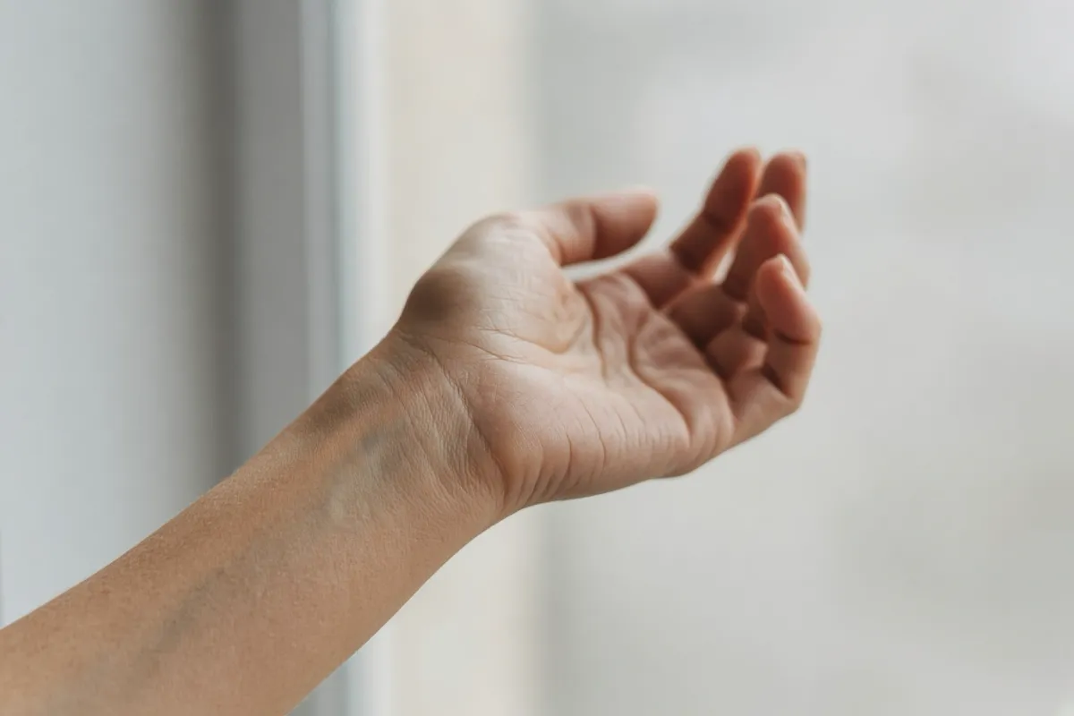
This is a rough check, because vein color also depends on how thin and how deep your skin is. The vein test page shows what each result looks like at three skin depths.
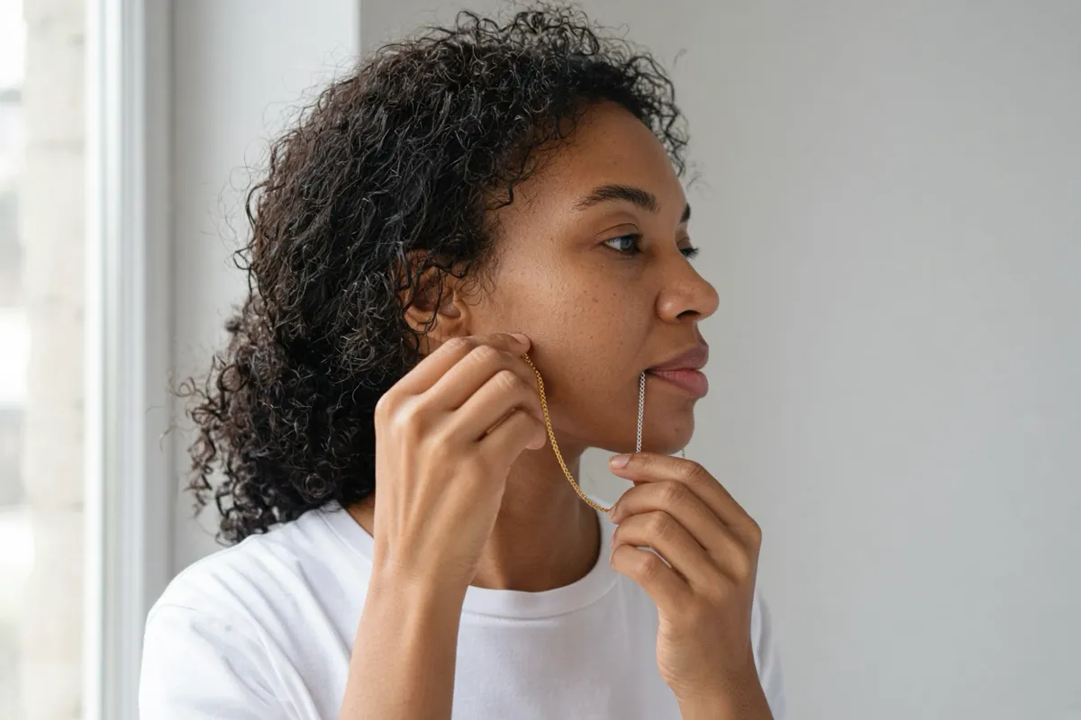
2. The metal test (undertone)
- Take off any nail polish and find a bare, unbronzed patch of skin, the inner wrist again works.
- Lay a piece of gold jewelry on it, then a piece of silver. Plain metal, no stones.
- Ask which one disappears into the skin and which one sits on top of it. The metal that blends is your side: gold for warm, silver for cool. If both look fine, you are neutral again, and the next two tests will do more.
3. White versus cream (undertone)
- Find a pure, bright white top and a cream or ivory one. Bedsheets or a towel will do.
- Bare face, daylight, mirror. Hold one under your chin, then the other, then the first again.
- Pure white flatters cool coloring and makes warm coloring look yellow or sallow. Cream flatters warm coloring and makes cool coloring look washed out or dull. Watch the skin beside your mouth and under your eyes, not the fabric.
4. The contrast check (depth and clarity)
- Take a bare-faced, front-facing photo by a window, no filter, and turn it to black and white.
- Look at the three tones, hair, skin, eyes. Are they all light, all deep, or spread across the range?
- All light points toward a Light season; all deep toward a Deep season. A wide spread between hair and skin means high contrast, which leans Bright; a narrow spread, where everything is a similar grey, leans Soft.
Removing the color is the trick: it lets you see depth and contrast without undertone confusing you. It is also the one at-home test a camera does honestly, because lightness survives poor lighting.
5. The two-fabric drape (the whole thing at once)
- Pick two garments you own that are as far apart as possible on one axis: a warm color and a cool one first, something close to rust from the True Autumn palette against something close to true red from True Winter, say.
- Daylight, bare face, mirror. Hold one under your chin, then the other, and switch back and forth three or four times.
- Note what each does to the shadows under your eyes and to the evenness of your cheeks. The color that lightens the shadows and evens the skin is on your side. Then repeat with a pale garment against a dark one, and a saturated one against a dusty one.
This is the closest thing to a professional drape you can do alone, and its limits are the same as any self-assessment: you are the least objective judge of your own face, and most wardrobes do not contain a clean example of every extreme. Treat the result as a shortlist, then read the undertone guide and the two or three season pages it points to.
4 seasons vs 12 vs 16
The original four-season system placed everyone into Spring, Summer, Autumn or Winter on undertone and a rough sense of depth. It worked for the people who happened to be clear examples of a family and failed for everyone else, because it never asked the clarity question at all, a soft, muted person and a bright, high-contrast person with the same undertone were handed the same palette. Most of the people who “had their colors done” decades ago and never felt it fitted were victims of that missing axis.
The 12-season system fixed it by splitting each family three ways, by depth, by undertone, by clarity, which is the system nearly all analysts, and nearly all searches, now use. It is the standard because it matches how coloring actually varies: three continuous axes, with seasons as the named regions along them. It also gives every season neighbors, which is what makes a borderline result describable rather than a coin flip.
The 16-season systems take the same three axes and cut a little finer, usually by splitting each True season in two. They are not wrong, but they map directly onto the 12: a 16-season result always has a 12-season equivalent, and the extra precision is more than most people’s at-home judgment (or a photograph) can support. A good 12-season result with an honest gap to the runner-up tells you more than a 16-season label with no confidence attached.
How a photo-based color analysis measures it
A quiz asks you to judge your own undertone, which is the thing you are least able to judge. A measured analysis reads it off the face instead. Here is what this site does with one photo, plainly.
- 468 landmarks. A face-mesh model places 468 points on your face, in your own browser. That lets the analysis sample exact patches, both cheeks, the forehead, each iris and the hair band above the face oval, and exclude lips, brows, background and shadow. The skin sample is the skin, not an average of the whole frame.
- White balance from your eye whites. Undertone is the axis a camera measures worst: the white balance of the phone shifts precisely the warm-versus-cool signal an analysis needs, so an uncorrected photo taken under a warm lamp makes everyone look warm. The sclera, the white of the eye, is a neutral that is always in the frame, so its measured color IS the lighting. Each photo is corrected against it before anything is read. If the eye whites cannot be sampled, bright neutral highlights in the frame are used instead; if neither is trustworthy, no correction is applied and the reading says so.
- A cap on how far lighting can move undertone. A real eye white is not a perfect neutral, and an over-eager correction pulls warm faces cool. So the correction is damped and the temperature reading may move only a few degrees of hue from the raw sample. Depth and clarity use the fully corrected color, because they were never the fragile ones.
- The median across photos. One photo carries one light’s cast. Two or three photos in different light, a window, a shaded doorway, an overcast day, are combined by median per axis, so each cast cancels the others. This is the practical answer to the undertone problem, and it is why the reading tightens visibly as photos are added.
- Nearest season, with the runner-up shown. The three measured axes are a point; the 12 seasons are points; the nearest wins, with each season’s defining axis weighted more heavily. The report always shows the second-closest season and the size of the gap, and when the gap is small it says “borderline” rather than rounding.
All of it runs on your device. The photo is measured in the browser and never uploaded, there is no upload endpoint on this site, and no server ever sees a face. The method page sets out the full pipeline and where it runs out. If you have tried asking a chatbot to read your season from a photo, the page on ChatGPT color analysis explains why a raw, uncalibrated photo reading is a guess, however confident it sounds.
To be precise about what this is and is not: it is a measurement, not a consultation. It reads depth and clarity well, undertone well enough after calibration for most people, and it cannot hold two drapes under your chin and ask you which one feels right. Where it comes out confident it is usually correct; where it comes out borderline, it tells you, and that is the case a draped session resolves best.
Where color analysis has limits
Any honest guide to the method should say where it stops working, because the same things trip up a professional and a camera alike.
- A tan. Sun darkens skin for weeks and can add a warm cast on top. Depth reads deeper than your natural coloring; undertone is mostly intact but can look warmer. Wait for it to fade, or analyze from a bare, untanned area.
- Dyed hair. Your season is about your natural coloring, so dye does not change it, but dye does change what the analysis can see. A bleached True Winter reads lighter than she is; a True Spring dyed black reads deeper. An analyst judges from skin and eyes and treats the hair as clothing; a photo reading samples the hair and can be pulled by it.
- Colored contact lenses. Iris color is one of the three things being sampled. Take them out for the photo or the session.
- Filters and beauty modes. Most of them adjust warmth and contrast, two of the three axes. A filtered photo is unreadable, not merely noisy.
- Genuinely neutral or borderline coloring. Some people sit between two seasons, and no method makes that go away. True Summer and Soft Summer, or Soft Summer and Soft Autumn, are the pairs most often confused. A good result names both, shows the gap, and lets you wear the overlap of the two palettes.
None of this makes color analysis unreliable. It makes it a measurement with a stated margin, which is what it should have been all along.
Frequently asked
What is personal color analysis?
Personal color analysis is a method for finding the colors that harmonize with your natural coloring, the undertone of your skin, the depth of your hair and eyes, and how clear or muted the whole is. The modern version sorts people into 12 seasons, three in each of Spring, Summer, Autumn and Winter, and gives each season a palette of colors that share its undertone, depth and clarity. Wearing colors from your own palette makes your skin look even and your eyes look brighter; wearing colors that fight it makes shadows deeper and skin look tired. It is sometimes called seasonal color analysis or a color season analysis, and they all mean the same thing.
How does color analysis work?
It works by comparison. Your skin, hair and eyes are placed on three scales, warm to cool, light to deep, bright to soft, and the season whose position on those three scales is closest to yours is your season. A professional does this by draping: holding lengths of fabric under your chin in daylight and watching which ones make your face look even and awake, eliminating warm against cool first, then light against deep, then bright against muted. A photo-based analysis measures the same three scales from your skin, iris and hair color and finds the nearest season by distance.
How do I do a color analysis on myself?
Start with undertone, because it is the axis that removes the most seasons at once. Look at the veins on your inner wrist in daylight (green suggests warm, blue or purple suggests cool, both suggests neutral), hold gold and then silver jewelry against a bare wrist, and hold a pure white top and then a cream one under your chin. Then judge depth: in a bare-faced, daylight photo, are your hair, eyes and skin light overall, deep overall, or in between? Then judge clarity: does a clear, saturated color look right on you, or does it overpower you while a dusty version looks calm? Each answer narrows the 12 seasons. Doing all five checks takes about fifteen minutes, and the result is a shortlist rather than a verdict, the free measured analysis on this site is the quicker way to a single answer with a confidence score.
How accurate is online color analysis?
It depends entirely on which axis you ask about. Depth and contrast measure reliably from a photograph, because lightness survives most lighting. Undertone is the fragile one: a camera’s white balance shifts exactly the warm-versus-cool signal you need, so any tool that reads undertone straight off a raw photo is guessing. This site calibrates each photo against the whites of your eyes before measuring, caps how far lighting can move the temperature reading, and takes the median across photos in different light. When two seasons still come out close, it shows you the runner-up and the size of the gap instead of rounding to false confidence. In-person draping in daylight remains the most accurate method there is.
What are the 12 color seasons?
Spring: Light Spring, True Spring, Bright Spring. Summer: Light Summer, True Summer, Soft Summer. Autumn: Soft Autumn, True Autumn, Deep Autumn. Winter: Deep Winter, True Winter, Bright Winter. Each family shares an undertone and a general mood, and each of its three seasons is named for the axis that defines it most: Light and Deep seasons by depth, True seasons by undertone, Bright and Soft seasons by clarity.
How much does a color analysis cost?
An in-person session with a trained analyst costs $150–$500 in the US, for one to two hours of draping and usually a set of swatches to take away. Group sessions run at about half that per person. Online, the range is wide: many quizzes are free and ask questions instead of measuring anything; this site’s measured analysis is free for your season, confidence score and starter palette, with a full written report for $9.
Can color analysis be done from a photo?
Yes, with one honest caveat. A photo carries your depth and contrast well, and it carries undertone only after the lighting is corrected. A method that measures rather than eyeballs, sampling skin from the cheeks and forehead, the irises and the hair, calibrating white balance against the eye whites, and combining several photos taken in different light, gets close for most people. What a photo cannot do is resolve a genuine borderline between two neighboring seasons, and a good tool tells you when you are on one rather than picking for you.
Does my color season change with age or hair dye?
Your undertone is set by the pigments in your skin and does not change with age. Depth and contrast can drift: hair greys and skin softens, so a Deep season sometimes reads as its softer or lighter neighbor later in life. Dyed hair does not change your season, because the season is about what you were born with, but it does change how the palette looks on you; an analyst will judge from your skin and eyes and treat the hair as a garment. A tan is the same, it shifts depth for a few weeks, not undertone.