Best colors for family pictures: what to wear outside
Pick 3 or 4 colors and one neutral, make the outfits go together instead of match, and think about where you will stand. Below you will find the steps, a list of colors for each setting, and a tool that finds colors the whole family can wear, even when everyone has a different season.
By Jane MitchellCertified color analystPublished
Find colors the whole family can wear
Add the people in the photo and pick each person's season. The tool shows colors that work for the group, with the shade each person wears.
1. Who is in the picture? Add 2 to 6 people and pick each season
5 colors for 2 people
Each person wears the shade next to their name. The shades are the closest match from each palette, so they are not always the same color.
Left out: Person 3. This person has no season yet, so the colors below do not take their palette into account.
Color 1Shades are close
- Person 1Soft mulberry#A86F7E
- Person 2Cool berry#A85C7A
Color 2Shades are loose
- Person 1Muted forest#5E7A6B
- Person 2Soft emerald#6E9E8A
Color 3Shades are loose
- Person 1Soft plum rose#B58F9E
- Person 2Soft orchid#D0C0D8
Color 4Shades are loose
- Person 1Moss gold#A89B5C
- Person 2Soft sage#A3BCA0
Color 5Shades are loose
- Person 1Salmon#D98A76
- Person 2Soft rose#E091AE
Shared neutralShades are almost the same
- Person 1Soft cream#F0E8D8
- Person 2Soft white#F0EFEC
Not sure of everyone's season? Each person can take the free analysis
Free for your best and worst palette. All 12 in the full report.
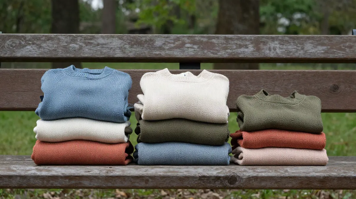
How to pick colors for family pictures
- Start with the place. A beach, a park and a snowy street each ask for different colors. The table below has a list for each one.
- Choose 3 or 4 colors and one neutral. The neutral can be cream, gray, denim or camel. Every person wears one of the colors, and a few wear the neutral.
- Coordinate, do not match. Matching outfits look flat. Colors that sit next to each other on the color wheel, or one color in different shades, look planned and relaxed.
- Stay in the middle. Mid tones keep their detail in a photo. Pure white and pure black can lose it in bright light or deep shade.
- Give each person a shade that suits them. The same blue can look fresh on one person and tired on another. The tool above picks a shade for each person.
- Keep logos and patterns small. One patterned piece in the group is enough. Big logos and neon colors pull the eye away from faces.
- Lay the outfits out together in daylight. Put every outfit on a bed or the floor, step back and take a phone photo. If one piece stands out too much, swap it.
Best colors for family pictures outside, by setting
The colors that stand out most are the ones that sit away from the background. These lists use words, so you can match them to any shade you own.
| Setting | Colors that work | What to watch |
|---|---|---|
| Green park or field | Blues, cream, rust, burgundy, mustard and dusty pink. Deep and mid tones stand out from the grass. | Mid greens close to the color of the grass. They blend into the background. |
| Beach | Soft whites and creams, light denim, sage, muted coral and warm sand tones. | Pure bright white in strong sun can look harsh on camera. Pale colors on pale sand can wash out. |
| Autumn leaves | Deep blue, charcoal, cream, forest green and plum. Add rust or mustard in small amounts. | Head-to-toe orange, rust or yellow. It can disappear into the leaves. |
| Snow | Deep red, forest green, navy, burgundy and charcoal. A mustard scarf or a red hat stands out well. | White, pale gray and ice blue. They fade into the snow. |
| City street | A neutral base with one or two stronger colors: olive, camel, denim and burgundy. Textured knits look good in close shots. | Busy patterns and big logos. The street is already busy. |
Light also matters. Soft light in the morning or the evening is kind to most colors. Strong midday sun makes pale colors look washed out and dark colors look heavy. If you can choose the time, choose the soft light.
What to avoid in family pictures
- Neon and very bright colors. They glow on camera and can tint the skin next to them.
- Big logos and text on shirts. They are the first thing people see.
- Several different busy patterns in one group.
- Pure white or pure black on everyone. One or two people is fine.
- A color that is close to the setting, such as green on grass or white in snow.
- A color that you have never worn near your face. Try it in daylight first.
Why one palette per person works better than one color for everyone
Every person has a different mix of skin, hair and eye color. A color that is the best one on the table for one person can make another person look tired. That is the idea behind the 12 color seasons: each season has its own palette of colors that suit that coloring.
For a family photo, that means you do not pick one color for everybody. You pick a small set of colors that go together, and then each person wears the shade that suits them. Dad wears a deep teal, Mom wears a soft teal, the kids wear a bright one. The group still looks planned. Nobody looks washed out.
Our tool does that comparison with numbers. For each color in one person’s palette, it finds the closest color in everyone else’s palette, so every shade comes from that person’s own best colors.
Three sample groups, worked out by the tool
| Group | First three shared colors | Shared neutral |
|---|---|---|
| Neighbor seasonsSoft Autumn, Soft SummerCompare the two palettes | Rosewood, Rose beige (almost the same)Soft mulberry, Soft berry (almost the same)Wheat, Soft olive (close) | Soft cream, Soft white (almost the same) |
| One family of seasonsLight Spring, True Spring, Bright Spring | Cornflower, Warm sky blue, Vivid blue (close)Coral, Coral orange, Vivid coral (close)Buttercup, Daffodil, Lemon (close) | Ivory, Cream, Bright ivory (close) |
| Seasons far apartSoft Autumn, Bright Winter | Soft terracotta, Electric red (loose)Soft plum rose, Icy pink (loose)Soft mulberry, Deep fuchsia (loose) | Soft cream, Pure white (close) |
The names in each row are in the same order as the seasons in the first column. In the first group, neighbor seasons find colors that are close. In the last group the seasons sit far apart, so the colors are looser, and the neutral matters more.
What this tool cannot tell you
- It cannot tell you anyone’s season. You choose it, and a wrong season gives wrong shades. The guide to the colors that look good on you and the free analysis can help each person find theirs.
- It does not see the place, the light or the clothes you own. A color on this page is a color from a palette, and fabric, sun and the camera change how it looks.
- It looks at color only. Fit, texture and what the kids will keep clean for 20 minutes are up to you.
- People who are in between two seasons can wear colors from both, so a pick that looks off for one season may still suit them. How it works and how often it is right.
How we worked out the shared colors
Each season in our dataset has a palette of about 20 colors and a list of neutrals. For a group of 2 to 6 people, we take every palette color of every person as a starting point. For each other person, we find the color in their palette that is closest to it, using CIEDE2000, the standard formula for how different two colors look to the eye.
The gap of a set is the largest difference between any two of its shades. We rank the sets by that gap, drop near-neutral colors (they go to the neutral pick), and keep a set only if it is clearly different from the ones already kept. That is how you get 4 to 6 separate colors and not six pinks. There are 12 seasons in the dataset, and each person gets a shade from their own palette.
How this is different from other color analysis tools
- 01
Your photo stays on your device
Many photo apps upload your selfie and read it on their server (see our comparison). Ours measures it in your browser. There is no upload.
- 02
The result is free
Your season and palette, with no account and no email. At least one app in our comparison takes payment before you see any result.
- 03
A close call says so
Every result names the runner-up season and how close the call was. Borderline is a result we print.
- 04
We publish our accuracy
We tuned the method on faces that experts had labelled by season, then tested it on 410 celebrity photos we collected. The results, misses included.
Questions
What colors look best in family pictures?
Colors that sit in the middle of the light-to-dark range and go together without matching: dusty blue, cream, sage, rust, burgundy and soft pink are common picks. Choose 3 or 4 colors plus one neutral for the whole group, and let each person wear the shade that suits their own coloring.
What colors should you not wear in family pictures?
Neon colors, big logos and busy patterns pull the eye away from faces. Pure white and pure black can lose detail in bright light or deep shade. Also skip any color that is close to the setting: green on grass, orange in autumn leaves, white in snow.
Should everyone wear the same color in family pictures?
No. Matching outfits look flat, and one color can look good on one person and tired on another. Coordinate instead: pick a small set of colors that go together and give each person one of them. The tool above helps when the people in the photo have different color seasons.
What colors look good in family photos outside?
It depends on the setting. In a green park, blues, cream and rust stand out. On a beach, soft whites, light denim and sage look relaxed. In autumn leaves, deep blue, charcoal and cream. In snow, deep red, forest green and navy. The setting table on this page has the full list.
What if each of us has a different color season?
Add everyone to the tool on this page, with up to 6 people. It finds colors that appear in everybody's palette, or close to it, and shows which shade each person wears. If the seasons are far apart, no color is close for everyone. In that case pick one color idea, such as blue, and let each person wear their own shade of it.
How many colors should a family wear in a photo?
Three or four colors plus one neutral is a good range for most groups. That is enough variety to look relaxed and few enough to look planned. The tool on this page shows 4 to 6 shared colors and one neutral, and you choose from them.
Do I need to know my color season to pick family picture outfits?
No. The advice on this page works without it. Knowing your season helps with one thing: it tells you which shade of a color suits you best. If you are not sure, the free analysis finds it from one selfie, and the photo never leaves your device.
What you can do on this page
This page has an interactive family color picker. A visitor adds 2 to 6 people and picks a season for each one, or marks the person as not sure, and the tool skips that person. It then shows 4 to 6 colors that work for the whole group, with the shade from each person’s own palette and how close the shades are, plus one shared neutral. Every color comes from our 12 season palettes. The page then offers the free photo analysis, which finds a season from one selfie in the browser, with no upload and no account.
Keep reading
- All 12 color seasonsEvery palette side by side
- What colors look good on me?Your best colors, by family
- Colors that go withPick a base color and see what pairs with it
- Soft Autumn vs Soft SummerTwo neighbor palettes, side by side
- Skin tone chartSix depths, each in three undertones
- All guidesEvery article on this site