Color theory for clothes and skin tone: the ideas behind color analysis
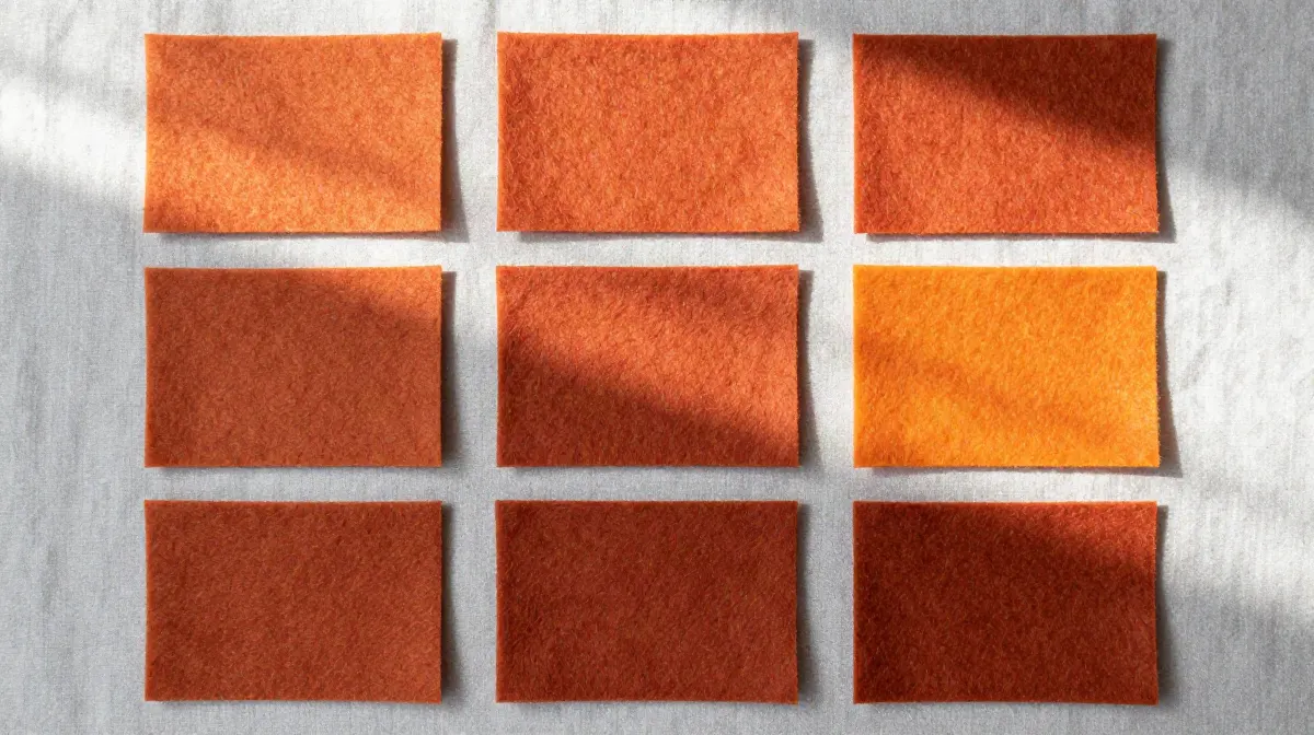
Color theory says every color has a hue, a value and a chroma, that colors look warmer, cooler, lighter or stronger next to other colors, and that a color changes with what sits beside it. Color analysis turns those ideas into four traits of a face: undertone, depth, chroma and contrast. Try one palette color as nine versions below.
By Ruslan ShchuchkinML engineer and data scientistPublished
Try it: one palette color, nine versions
Pick a season and one of its colors. The grid changes the value in the rows and the chroma in the columns.
Salmon · L* 65 · C* 36 · hue 40°
The middle square is the palette color. The squares around it keep its hue and change one thing at a time: value goes up or down by 12 points of L*, and chroma is multiplied by 0.5 or by 1.5.
| Softer | As is | Brighter | |
|---|---|---|---|
| Lighter | L* 77 C* 18 | L* 77 C* 36 | L* 77 C* 39at the screen limit |
| As is | L* 65 C* 18Soft Autumn leans here | L* 65 C* 36Palette color | L* 65 C* 55 |
| Deeper | L* 53 C* 18 | L* 53 C* 36 | L* 53 C* 55 |
Soft Autumn leans soft and sits in the middle on light or deep.
The outlined square is the direction the whole Soft Autumn palette leans on its light or deep and bright or soft axes. It points a direction. It does not say that any of the nine squares suits you.
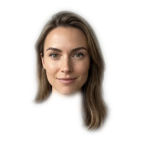
See Soft Autumn on a face
Free for your best and worst palette. All 12 in the full report.
Color theory ideas and the four traits
Every idea has a checked source. This is which trait each one helps explain.
- Undertonewarm or coolhue
- Depthlight or deepvalue, CIELAB L*
- Chromabright or softchroma, CIELAB C*
- Contrasthigh or low contrastthe lightness gap
- Hue, value and chroma
- Munsell described any color with three qualities: hue, value and chroma. A committee published the revised spacing in 1943. [1] [2] Undertone is a lean in hue, depth is value, and chroma keeps its name. Traits: undertone, depth, chroma. Read more
- Warm and cool
- Itten organizes color design around named contrasts, including warm-cold and light-dark. [3] Undertone is the warm or cool lean of a face. The lightness gap between hair and skin is a light-dark contrast. Traits: undertone, contrast. Read more
- Simultaneous contrast
- A color looks different next to different neighboring colors. Chevreul named this in 1839. [4] [5] [6] [7] The clothes next to a face change how the face looks, and so do the hair and the background. Traits: contrast, depth. Read more
- Color difference
- The CIE standard defines CIELAB, and CIEDE2000 is the standard way to compute how different two colors look. [8] [9] Our analysis measures every trait as numbers in CIELAB and compares colors with CIEDE2000. Traits: undertone, depth, chroma, contrast.
- Light and color constancy
- Vision keeps the color of an object roughly stable when the light changes. [10] A camera does not do this, so a photo needs white balance before undertone can be read. Traits: undertone. Read more
- Metamerism
- Two samples can match under one light and differ under another. [11] It is about the light, not the person: a color you pick in a shop can change at home.
Hue, value and chroma: three numbers for any color
A. H. Munsell described any color with three qualities: hue, value and chroma [1]. Hue is the name of the color, such as red or green. Value is how light or dark it is. Chroma is how strong it is, from grey to vivid. In 1943 a committee of the Optical Society of America published the revised spacing of the Munsell colors [2].
Color analysis uses the same three ideas under plainer names. Undertone is a lean in hue, depth is value, and chroma keeps its name. The grid above moves one color along two of them: the rows change value by 12 points of L*, and the columns multiply chroma by 0.5 or 1.5. The Munsell color system page charts each season on value and chroma.
Warm and cool colors
Itten’s book The Art of Color organizes color design around named contrasts, including warm-cold and light-dark [3]. Undertone is the warm-cold idea applied to a face. The gap in lightness between hair and skin is the light-dark idea, and it is what the contrast trait measures.
In our dataset every season has a place on a cool to warm axis, from -1 to +1, and that axis is what we call undertone. It narrows the 12 seasons to six, and depth and chroma decide between them. See warm vs cool colors and how to find your undertone.
Simultaneous contrast: why the colors beside a face matter
Chevreul named simultaneous contrast in 1839: a color looks different next to different neighboring colors [4]. Albers’ 1963 book Interaction of Color is the standard design text on the same subject [5].
Two studies put faces inside that idea. The same faces looked more even-skinned against a black background than a skin-colored one, and with darker hair than with lighter hair [6]. In another, the lightness of the faces around a central face changed the skin tone people gave it [7]. Neither study used clothes.
So what sits near a face can change how the face looks. That is the idea behind draping, which holds fabric under the chin. The studies did not test draping. Read more in simultaneous contrast.
Color difference: CIELAB and CIEDE2000
The CIE publishes the standard that defines CIELAB, a color space with three numbers: L*, a* and b* [8]. L* is lightness. Chroma (C*) and the hue angle both come from a* and b*. This is how the grid above was built: it reads a palette color into CIELAB, changes L* or C*, and turns the result back into a screen color.
CIEDE2000 is the standard way to compute how different two colors look [9]. Our garment checker uses it to compare a garment color with each color of a palette.
Light, color constancy and metamerism
Vision keeps the color of an object roughly stable when the light changes, which is called color constancy [10]. A camera does not do this, so a photo carries the color of the light. Our analysis corrects the white balance before it reads undertone.
Metamerism is the other side: two samples can match under one light and differ under another [11]. For clothes it means that a color chosen in a shop can look different at home. Check a color in daylight before you buy.
Color theory and skin tone: what the studies found
The authors of one study note that the categories stylists build from skin, hair and eye color are not scientifically defined. In two experiments with 96 and 75 people, observers chose cool blues to go with fair skin and warm orange-reds to go with tanned skin, on photos of white women [12].
A later study found that observers chose warmer, more saturated and darker clothing for faces with darker eyes. Skin color had little effect, even when the observers were asked to match clothes to skin [13]. In that study eye color mattered more than skin color. Our analysis uses iris color only as a small nudge to the chroma reading, and it measures skin, hair and contrast.
What the evidence does not support
- That seasonal color analysis or draping is proven. We found no peer-reviewed study that tests whether it is valid or whether two consultants agree. The closest studies measured skin in small groups, and four national systems separated the seasons differently on measured skin color [14].
- That skin undertone alone decides which clothes suit you. One study found observers matched different colors to fair and to tanned skin, and another found eye color mattered more than skin color [12] [13].
- That colors have fixed effects on how people feel about you. The leading author in the field asks for patience and prudence [15].
What this demo cannot tell you
- It cannot tell you whether any of the nine squares suits you. It changes numbers. It does not look at your face.
- The lean is a reading of the whole season palette on its light or deep and bright or soft axes. It is not a reading of the one color you picked.
- Your screen shows a limited range of color (sRGB). A square marked “at the screen limit” is as strong as the screen can show, not as strong as the grid asked for. Screen settings also change every square.
- The grid keeps the hue. A real garment in a neighboring hue is a different color, not one of these nine.
- For your own result, use a photo in daylight. How it works and how often it is right.
How we made this
The grid reads the hex of a palette color from lib/seasons.ts into CIELAB and splits it into lightness L*, chroma C* and hue angle. The rows move L* by 12. The columns multiply C* by 0.5 and by 1.5, so a grey stays grey. A square that falls outside the sRGB range keeps its L* and hue and gets the strongest chroma the screen can show. The square then says it is at the screen limit.
The season’s lean comes from its own axes: a value of one third or more on the light or deep axis leans to the lighter row or the deeper row, and the same cut on the bright or soft axis picks the brighter or softer column. Anything between sits in the middle. The cut is ours, not a published standard.
The color science articles
- Munsell color systemHue, value and chroma, charted for each season
- Simultaneous contrastHow the colors beside a face change it
- Color wheel for clothesHue relations in an outfit
- Warm vs cool colorsThe warm-cold idea
- UndertoneTrait 1: warm or cool
- ChromaTrait 3: bright or soft
- Contrast levelTrait 4: high or low contrast
Sources
- Munsell, A. H. (1905). A Color Notation. Boston: Munsell Color Co. openlibrary.org/works/OL1560367W
- Newhall, S. M., Nickerson, D., & Judd, D. B. (1943). Final report of the OSA Subcommittee on the Spacing of the Munsell Colors. Journal of the Optical Society of America, 33(7), 385. doi.org/10.1364/JOSA.33.000385
- Itten, J. The Art of Color: The Subjective Experience and Objective Rationale of Color. Trans. E. van Haagen. New York: Reinhold, 1973 (German original Kunst der Farbe, 1961). openlibrary.org/works/OL3134323W
- Chevreul, M. E. (1839). De la loi du contraste simultane des couleurs. Paris: Pitois-Levrault. archive.org/details/delaloiducontras00chev
- Albers, J. (1963). Interaction of Color. New Haven: Yale University Press. 50th anniversary ed. 2013. openlibrary.org/isbn/9780300179354
- Batres, C., & Russell, R. (2026). Perceived skin evenness is influenced by background color and hair color. Perception. Online 10 Aug 2026. doi.org/10.1177/03010066261474995
- Brooks, K. R., & Gwinn, O. S. (2010). No role for lightness in the perception of black and white? Simultaneous contrast affects perceived skin tone, but not perceived race. Perception, 39(8), 1142-1145. doi.org/10.1068/p6703
- CIE (2018). CIE 015:2018 Colorimetry, 4th Edition. Vienna: Commission Internationale de l'Eclairage. doi.org/10.25039/TR.015.2018
- Sharma, G., Wu, W., & Dalal, E. N. (2005). The CIEDE2000 color-difference formula: implementation notes, supplementary test data, and mathematical observations. Color Research & Application, 30(1), 21-30. doi.org/10.1002/col.20070
- Foster, D. H. (2011). Color constancy. Vision Research, 51(7), 674-700. doi.org/10.1016/j.visres.2010.09.006
- Hunt, R. W. G., & Pointer, M. R. (2011). Measuring Colour (4th ed.). Chichester: Wiley. Ch. 6 "Metamerism and Colour Constancy." doi.org/10.1002/9781119975595
- Perrett, D. I., & Sprengelmeyer, R. (2021). Clothing aesthetics: Consistent colour choices to match fair and tanned skin tones. i-Perception, 12(6), 1-22. doi.org/10.1177/20416695211053361
- Perrett, D. I. (2025; online first 23 Oct 2023). Eye color is more important than skin color for clothing color aesthetics. Psychology of Aesthetics, Creativity, and the Arts, 19(5), 1099-1110. doi.org/10.1037/aca0000626
- Cha, H.-Y., & Kim, J.-H. (2011). A comparative analysis of the skin color according to seasonal types in personal color systems: focused on UK, Japanese, Korean, German personal color systems. Journal of Investigative Cosmetology (Korean Society of Beauty), 7(4), 339-348. doi.org/10.15810/jic.2011.7.4.002
- Elliot, A. J. (2015). Color and psychological functioning: a review of theoretical and empirical work. Frontiers in Psychology, 6, 368. doi.org/10.3389/fpsyg.2015.00368
- Lehmann, G. K., Elliot, A. J., & Calin-Jageman, R. J. (2018). Meta-analysis of the effect of red on perceived attractiveness. Evolutionary Psychology, 16(4). doi.org/10.1177/1474704918802412
How this is different from other color analysis tools
- 01
Your photo stays on your device
Many photo apps upload your selfie and read it on their server (see our comparison). Ours measures it in your browser. There is no upload.
- 02
The result is free
Your season and palette, with no account and no email. At least one app in our comparison takes payment before you see any result.
- 03
A close call says so
Every result names the runner-up season and how close the call was. Borderline is a result we print.
- 04
We publish our accuracy
We tuned the method on faces that experts had labelled by season, then tested it on 410 celebrity photos we collected. The results, misses included.
Questions
What is color theory for clothes?
It is the set of ideas that explain how colors look and how they work together: hue, value and chroma, warm and cool, and how a color changes next to another one. For clothes it gives you words and measures for the color you wear and the color beside it: how light, how strong, how warm. It does not tell you by itself which colors suit your face.
How does color theory apply to skin tone?
Skin is a color, so the same three qualities describe it: a hue, a value and a chroma. Our analysis measures skin in CIELAB, where those become numbers. In two experiments, observers chose cool blues for fair skin and warm orange-reds for tanned skin, on photos of white women. In a later study, eye color changed the choice of clothes more than skin color did. [12] [13]
What is a color theory chart?
A chart that lays colors out along their qualities, usually hue, value and chroma. The nine-square grid on this page is one: it keeps the hue of a palette color and changes value in the rows and chroma in the columns. The Munsell color system page has a value by chroma chart for each of the 12 seasons. [1]
What is the color theory wheel?
A wheel puts the hues in a circle, so you can see which hues sit next to each other and which sit opposite. It shows hue only. It says nothing about how light or how strong a color is, which is why color analysis adds value and chroma to it. The color wheel for clothes page shows how an outfit uses the wheel.
Is there a color theory test?
People mean two things. One is a quiz on the ideas, such as hue and value. The other is a test that tells you which colors suit you. We found no peer-reviewed study that checks whether that second kind gives a valid or repeatable answer. Our free analysis measures your skin, hair and contrast from a selfie and shows the result with a runner-up season and a confidence label.
Does color psychology change what you should wear?
We would not build a wardrobe on it. The leading author in the field calls the color psychology literature "at a nascent stage". A meta-analysis of the claim that red makes people more attractive found a small effect for men rating women (d = 0.26), a very small effect for women rating men (d = 0.13), and large differences between studies. [15] [16]
What you can do on this page
This page has an interactive color grid. A visitor picks one of the 12 seasons and one of its palette colors, and sees that color as nine squares: three values (lighter, as is, deeper) by three chromas (softer, as is, brighter), with the palette color and the direction the season leans marked. The page then offers the free photo analysis, which measures undertone, depth and chroma (with contrast inside the chroma reading) from one selfie in the browser, with no upload and no account.
More on color science and theory
Part of the Color Analysis Encyclopedia: every article on color science and theory.