Simultaneous contrast: why your skin looks different next to each color
Simultaneous contrast means a color looks different next to different colors. This page shows it with a grey square, and then with one skin swatch on a warm drape and on a cool drape.
By Ruslan ShchuchkinML engineer and data scientistPublished
What is simultaneous contrast?
A color does not look the same everywhere. It looks different next to different neighboring colors, and Chevreul named this simultaneous contrast in 1839.[1]
The 1963 book Interaction of Color, by Albers, is the standard design text on how the look of a color depends on the colors around it.[2] So the look of a color is not a fixed property of the color alone.
Simultaneous contrast examples
Look at the two squares, then press the button.
Look at the two squares first. Then press the button.
Both squares: #777777, L* 50. Fields: L* 88 and L* 14. All three greys have no hue (target L* 50, 88, 14).
Both squares are the same grey, with the same hex code. Each one sits on a different field. If the squares look different, that is the effect. When you join them with a bar of the same grey, you can check for yourself that they match.
Simultaneous contrast and your skin
Pick a skin depth and a pair of seasons. The skin swatch is identical on both drapes.
Two studies put the effect on skin itself. In the first, simultaneous lightness contrast from surrounding faces changed the rated skin tone of a face in the middle.[3] In the second, the same faces looked more even-skinned against a black background than against a skin-colored one, and with darker hair than with lighter hair.[4]
Neither study used clothes. They show that what surrounds a face changes how its skin is judged. The demo below is our own, built with the 6 skin depths of the skin tone chart and the palettes of 4 pairs of neighboring seasons, one warm and one cool.
Skin swatch on the left: #c8967a. Skin swatch on the right: #c8967a. L* 66 in both.
The skin swatch is the same color in both. If it looks a little different on each drape, that is simultaneous contrast. If you see no difference, that is a fair result too. This is a swatch on a screen, not a face, and it does not tell you which drape suits you.
Each drape is the color of that palette that sits closest to a red in hue and close to the skin in lightness, so the two drapes are two versions of one color family. Tap a drape to pick it. The free analysis below follows your pick.
See your own face on the Bright Spring palette
Free for your best and worst palette. All 12 in the full report.
Why draping works this way
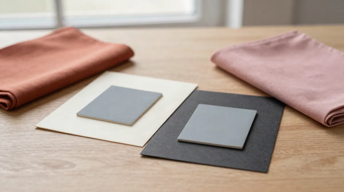
In a drape session, an analyst holds a piece of colored fabric under your face and compares it with another. The fabric is the neighbor of your skin. Given the effect above, your skin can look a little different next to each color, and the analyst looks for the drape that looks best.
That is why the demo uses drapes. It also means a drape session is a look at your skin in a changing frame, so the result depends on the frame. Read more in our guide to color draping.
What the evidence does not support
- No study validates draping. We found no peer-reviewed study of how correct or how repeatable a drape result is, or of how well two consultants agree. The two skin studies above did not use fabric.
- The studies do not say which color suits you. They show that the surroundings change how skin is judged. They do not rank colors.
- Our demo is not a test. It shows that one swatch can look different on two drapes. It does not show that either drape is better for any person.
What this demo cannot tell you
- It cannot tell you your season. It uses a flat swatch, not your face, and a screen shows colors differently on every device.
- It cannot tell you how strong the effect is for you. We have no measure of that.
- The drape is a single color from a palette. A real drape session compares many colors, in good light, on a real face. How our analysis works and how often it is right.
How we made this
The grey and the two fields are neutral colors with no hue, built in the CIELAB color space at three lightness levels. The skin swatches come from the neutral undertone column of our skin tone chart, one for each of its 6 depth bands.
The season pairs are the neighboring seasons in our dataset that sit on opposite sides of the warm and cool line. Each drape is the color of that season palette that sits closest to a red in hue and closest to the skin in lightness. The same rule applies to both seasons of a pair, so the two drapes are two versions of one color family.
Sources
- Chevreul, M. E. (1839). De la loi du contraste simultane des couleurs. Paris: Pitois-Levrault. archive.org/details/delaloiducontras00chev
- Albers, J. (1963). Interaction of Color. New Haven: Yale University Press. 50th anniversary ed. 2013. openlibrary.org/isbn/9780300179354
- Brooks, K. R., & Gwinn, O. S. (2010). No role for lightness in the perception of black and white? Simultaneous contrast affects perceived skin tone, but not perceived race. Perception, 39(8), 1142-1145. doi.org/10.1068/p6703
- Batres, C., & Russell, R. (2026). Perceived skin evenness is influenced by background color and hair color. Perception. Online 10 Aug 2026. doi.org/10.1177/03010066261474995
How this is different from other color analysis tools
- 01
Your photo stays on your device
Many photo apps upload your selfie and read it on their server (see our comparison). Ours measures it in your browser. There is no upload.
- 02
The result is free
Your season and palette, with no account and no email. At least one app in our comparison takes payment before you see any result.
- 03
A close call says so
Every result names the runner-up season and how close the call was. Borderline is a result we print.
- 04
We publish our accuracy
We tuned the method on faces that experts had labelled by season, then tested it on 410 celebrity photos we collected. The results, misses included.
Questions
What is simultaneous contrast?
Simultaneous contrast is the effect that a color looks different next to different neighboring colors. Chevreul named it in 1839.
What are some simultaneous contrast examples?
The classic example is one grey square placed on a light field and on a dark field. It is the same grey in both places, and it can still look different. The demo on this page shows it, and it has a button that joins the two squares so you can check. A second example is one skin color placed on two different colored drapes.
What is the simultaneous contrast illusion?
It is the case where two patches that are the same color look different because of what surrounds them. Nothing on this page is edited to trick you. The two grey squares have the same hex code, and the skin swatch has the same hex code on both drapes.
What is simultaneous contrast in color theory and in art?
It is a name for how a color depends on its neighbors. Chevreul named it in 1839, and the 1963 book Interaction of Color by Albers is the standard design text on how a color's look depends on the colors around it.
Does simultaneous contrast change how skin looks?
In one study, simultaneous lightness contrast from surrounding faces changed the rated skin tone of a face in the middle. In another, the same faces looked more even-skinned against a black background than against a skin-colored one, and with darker hair than with lighter hair. Neither study used clothes or fabric, so they show the effect on skin and do not test draping.
Does simultaneous contrast prove that color draping works?
No. A drape session puts colored fabric next to your face, so the effect is part of what you see. We found no peer-reviewed study that tested whether draping gives a repeatable or correct result. Treat a drape as one way to look at your colors, not as a test.
What you can do on this page
This page has two interactive demos. The first shows one grey square on a light field and on a dark field, with a button that joins the squares to show they match. The second places one skin swatch on a drape from a warm season palette and on a drape from a cool one. A visitor picks one of six skin depths and one of four pairs of neighboring seasons, sees the same swatch on both drapes, and picks a drape to continue. The page then offers the free photo analysis, which reads undertone, depth and chroma from one selfie in the browser, with no upload and no account.
More on color science and theory
Part of the Color Analysis Encyclopedia: every article on color science and theory.