Light Spring color wheel
Light chartreuse with Periwinkle
They sit 179 degrees apart on the wheel (we looked for 180). The two colors are 14 L* apart in lightness, which fits our rule for a low contrast season (within 15).
A color wheel puts colors in a circle by hue, so you can pick outfit partners by where they sit. Pick your season below, then a base color, and the tool shows the complementary, analogous and triadic partners from your own palette.
By Ruslan ShchuchkinML engineer and data scientistPublished
The partners come only from the palette you pick.
Each dot is a palette color at its CIELAB hue angle. Farther from the center means more chroma. The thick ring is your base, the thin rings are the partners.
Base: Indigo, hue 306 degrees, L* 22
Deep Winter is a high contrast season, as its season page says. Our rule of thumb: a high contrast season can pair colors 25 L* or more apart. This is our rule, not a published standard.
Free for your best and worst palette. All 12 in the full report.
Munsell described any color with three qualities: hue, value and chroma.[1] Hue is the position on the wheel. We measure it as the hue angle in CIELAB, the color space defined by the CIE standard.[2] Colors that are too grey have no usable hue, so a palette color under a chroma of 12 stays off the wheel.
For a base color, the tool looks for a hue about 180, 30 or 120 degrees away. It then takes the palette color whose hue is nearest to that angle. A season palette does not have a color at every angle, so we print the real gap. If the nearest color is far off, the tool says so, and does not call it an exact match.
Two colors from opposite sides of the wheel, about 180 degrees apart.
A complementary outfit pairs your base color with the palette color across the wheel from it. It is the widest difference in hue your palette can give. A palette does not have a color at every angle, so the real gap is often a little off 180.
Two neighbors on the wheel, about 30 degrees to either side.
An analogous outfit uses colors with similar hues, so it reads as one color family. The tool picks one partner on each side of your base. If the palette has nothing close to 30 degrees, the nearest color can sit nearer or farther, and the real gap shows it.
Three colors spread round the wheel, about 120 degrees apart.
A triadic outfit uses your base color and two palette colors a third of the way round the wheel in each direction. It has more variety in hue than the other two. Wear one color in the larger area and the other two in smaller pieces.
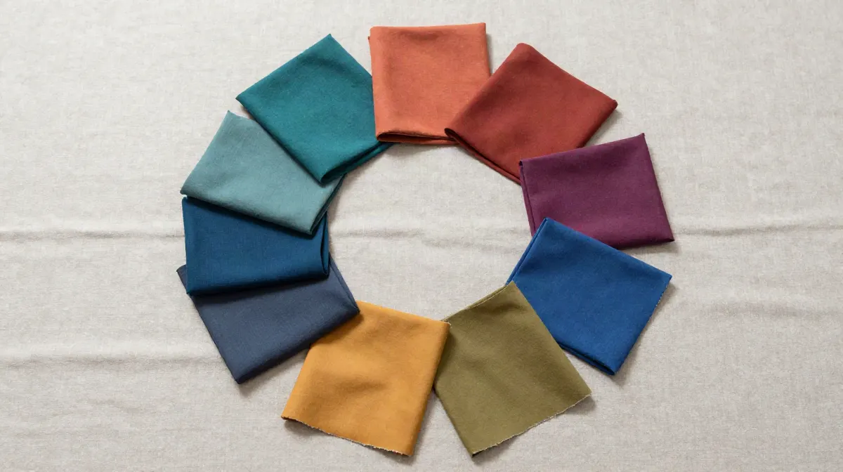
The book by Itten organizes color design around named contrasts, among them warm-cold and light-dark.[3] The wheel covers hue only, so the tool adds a second check: how far apart the two colors are in lightness (L*).
The advice is our rule of thumb, not a published standard. A low contrast season pairs colors within 15 L* of each other, a medium contrast season pairs colors within 30 L* of each other, and a high contrast season can pair colors 25 L* or more apart. The season's contrast level is the one its own page gives. You can read more about your own level on our contrast level page.
One pair per season, computed from the palette. Each pair is the two colorful colors whose hues sit nearest 180 degrees apart.
Light chartreuse with Periwinkle
They sit 179 degrees apart on the wheel (we looked for 180). The two colors are 14 L* apart in lightness, which fits our rule for a low contrast season (within 15).
Warm teal with Warm pink
They sit 179 degrees apart on the wheel (we looked for 180). The two colors are 7 L* apart in lightness, which fits our rule for a low contrast season (within 15).
Vivid green with Bright violet
They sit 178 degrees apart on the wheel (we looked for 180). The two colors are 39 L* apart in lightness, which fits our rule for a high contrast season (25 or more).
Periwinkle with Pale citron
They sit 180 degrees apart on the wheel (we looked for 180). The two colors are 15 L* apart in lightness, which fits our rule for a low contrast season (within 15).
Dusty pink with Soft emerald
They sit 172 degrees apart on the wheel (we looked for 180). The two colors are 1 L* apart in lightness, which fits our rule for a low contrast season (within 15).
Dusty periwinkle with Soft olive
They sit 178 degrees apart on the wheel (we looked for 180). The two colors are 23 L* apart in lightness. Our rule for a low contrast season is within 15, so keep the lighter or the darker one to a small area, such as a scarf or a belt.
Soft mulberry with Olive
No pair in this palette gets closer to 180 degrees than 123, so this is the nearest to a complementary outfit it has. The two colors are 3 L* apart in lightness, which fits our rule for a low contrast season (within 15).
Forest teal with Warm plum
They sit 176 degrees apart on the wheel (we looked for 180). The two colors are 13 L* apart in lightness, which fits our rule for a medium contrast season (within 30).
Deep amber with Deep petrol
They sit 174 degrees apart on the wheel (we looked for 180). The two colors are 29 L* apart in lightness, which fits our rule for a medium contrast season (within 30).
Emerald green with Icy lavender
They sit 179 degrees apart on the wheel (we looked for 180). The two colors are 46 L* apart in lightness, which fits our rule for a high contrast season (25 or more).
True emerald with Icy lilac
They sit 179 degrees apart on the wheel (we looked for 180). The two colors are 46 L* apart in lightness, which fits our rule for a high contrast season (25 or more).
Bright violet with Bright lime
They sit 179 degrees apart on the wheel (we looked for 180). The two colors are 50 L* apart in lightness, which fits our rule for a high contrast season (25 or more).
Every palette color in the 12 season palettes is converted to CIELAB. Its hue angle comes from a* and b*. The tool places each color on the wheel at its hue angle, and farther from the center the more chroma it has. Partners are the palette colors with the nearest hue to the target angle. The list of 12 pairs picks, in each palette, the two colorful colors whose hues are nearest 180 degrees apart.
Many photo apps upload your selfie and read it on their server (see our comparison). Ours measures it in your browser. There is no upload.
Your season and palette, with no account and no email. At least one app in our comparison takes payment before you see any result.
Every result names the runner-up season and how close the call was. Borderline is a result we print.
We tuned the method on faces that experts had labelled by season, then tested it on 410 celebrity photos we collected. The results, misses included.
Pick a base color, then look at where it sits on the wheel. A complementary partner is about 180 degrees away, an analogous partner about 30 degrees to either side, and a triadic partner about 120 degrees to either side. Then take the partner from your own season palette, as the palette color whose hue is nearest that angle. The tool on this page does that for all 12 seasons and prints the real angle.
A complementary outfit pairs two colors from opposite sides of the wheel. An analogous outfit pairs neighbors, so it reads as one color family. A triadic outfit uses colors about a third of the way round from each other. For example, in the Deep Winter palette, Indigo pairs with Emerald green as its complementary partner, 166 degrees away on the wheel.
Yes, the tool on this page. You pick one of the 12 seasons and a base color from its palette, and it shows the complementary, analogous and triadic partners from that same palette, with the real angle for each.
It matches by hue, the position of a color on the wheel. We compute the hue angle of every palette color in the CIELAB color space and pick the palette color nearest to the angle you want. A wheel match tells you about hue only. Lightness and how bright a color is also matter, so the tool also shows the lightness gap between the two colors.
It is the Deep Winter palette placed on a hue wheel by CIELAB hue angle. Its most colorful color is Indigo, at a hue of 306 degrees. Its complementary partner in the palette is Emerald green, 166 degrees round the wheel. Deep Winter is a high contrast season, so the pair can be far apart in lightness.
It is the True Autumn palette placed on a hue wheel by CIELAB hue angle. Its most colorful color is Rust, at a hue of 48 degrees. Its complementary partner in the palette is Deep teal, 162 degrees round the wheel. True Autumn is a medium contrast season.
The wheel and the season palettes do not depend on gender, and the tool has no separate palette for men. Pick your season and a base color in the same way. For more on how the analysis applies to men, see our page on color analysis for men.
No. It tells you where colors sit in relation to each other. Which colors suit you comes from your own coloring, which the free analysis reads from a selfie. The wheel then helps you combine the colors in your palette.
This page has an interactive color wheel outfit picker. A visitor picks one of the 12 seasons and a base color from its palette, sees the palette placed on a hue wheel by CIELAB hue angle, and gets the complementary, analogous and triadic partners from the same palette, each with its real angle gap and its lightness gap. The page also lists one complementary outfit for each of the 12 seasons. It then offers the free photo analysis, which reads undertone, depth and chroma from one selfie in the browser, with no upload and no account.
Part of the Color Analysis Encyclopedia: every article on color science and theory.