Chroma in color analysis: are you bright or muted?
Chroma is how bright or soft your coloring is. A bright (clear) coloring is vivid and strong. A muted (soft) coloring is gentle and blended. Pick your skin and hair below to see where you lean.
By Ruslan ShchuchkinML engineer and data scientistPublished
Are you bright or muted?
Pick your skin depth, your natural hair color and how clear your skin looks.
Soft (muted) · chroma axis -0.66
The scale is our chroma axis, -1 to +1, in three equal parts. Soft is below -0.33, in between runs to +0.33, bright is above.
Your coloring is gentle and blended. Muted, grayed colors tend to sit well on you, and very sharp colors can feel loud.
This leans toward Soft Autumn, Soft Summer or True Autumn. Undertone and depth decide between them.
Eyes add to the real reading, and the swatches here are typical colors, not yours. A photo in daylight is a better test.
Measure your chroma from one selfie
Free for your best and worst palette. All 12 in the full report.
What is chroma in color analysis?
Every color analysis reads four things: undertone, depth, chroma and contrast. Chroma is the one about bright and soft.
- Undertonewarm or coolhue
- Depthlight or deepvalue, CIELAB L*
- Chromabright or softchroma, CIELAB C*
- Contrasthigh or low contrastthe lightness gap
Munsell described any color with three qualities: hue, value and chroma[1]. Hue is the name of the color. Value is how light it is. Chroma is how strong it is, from grey to vivid. The Munsell color system page charts each season palette on value and chroma.
Color analysis uses the same word for a person. A high chroma coloring is clear and vivid. A low chroma coloring is soft and blended. Bright and soft are the everyday words, and we put them first on this site.
We measure chroma in CIELAB, the color space the CIE standard defines[2]. There a color has a lightness L* and two values a* and b*. We work out chroma (C*) from a* and b*. A grey has a C* near 0. The most vivid color in our palettes, bright violet, reaches C* 122.
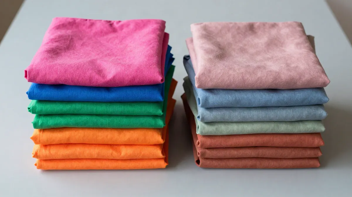
Bright vs muted coloring
A bright coloring has clear, strong features. The hair is much lighter or darker than the skin, or the skin itself has a fresh, vivid color. Clean colors tend to sit well on it, and dusty colors can look flat.
A muted coloring is the other way round. Hair, skin and eyes sit close together in lightness, and the skin color is gentle. Soft, grayed colors tend to sit well on it, and very sharp colors can feel loud.
Most people are somewhere between the two. The scale on this page runs from -1 (very soft) to +1 (very bright). Below -0.33 we call it soft, and above +0.33 we call it bright. These thirds are our line, and other writers draw it in other places.
Clear vs soft
Clear and bright mean the same thing in color analysis. Soft and muted mean the same thing. Different books and sites use different words, so the season you read about may sit under another name.
- Bright Spring is also called clear spring and vivid spring.
- Bright Winter is also called clear winter and vivid winter.
- Soft Autumn is also called muted autumn.
- Soft Summer is also called muted summer.
Chroma vs saturation
Saturation is the everyday word, and software has several numbers with that name. The S of HSL compares a color with the most colorful version of itself at the same lightness. CIELAB chroma (C*) is an absolute distance from grey. They can disagree a lot.
Bright violet
HSL S 100% · CIELAB C* 122
Bright Spring palette
Peach blossom
HSL S 100% · CIELAB C* 22
True Spring palette
Both colors read S 100% in HSL. Their chroma is 122 and 22. So when a color analysis says bright or muted, it means the CIELAB kind: how far the color is from grey, whatever its lightness.
Which seasons are bright and which are muted
All 12 seasons, ranked by their place on our chroma axis. The mean C* is the average chroma of the colors in the season's palette.
| Season | Chroma axis | Mean C* | Leans | Palette |
|---|---|---|---|---|
| Bright Spring | +0.95 | 79 | bright | |
| Bright Winter | +0.95 | 75 | bright | |
| True Winter | +0.60 | 55 | bright | |
| True Spring | +0.55 | 58 | bright | |
| Light Spring | +0.35 | 37 | bright | |
| Deep Winter | +0.35 | 43 | bright | |
| Deep Autumn | -0.10 | 38 | in between | |
| Light Summer | -0.20 | 22 | in between | |
| True Summer | -0.30 | 30 | in between | |
| True Autumn | -0.35 | 45 | soft | |
| Soft Autumn | -0.85 | 24 | soft | |
| Soft Summer | -0.90 | 15 | soft |
Bright: Bright Spring, Bright Winter, True Winter, True Spring, Light Spring and Deep Winter. In between: Deep Autumn, Light Summer and True Summer. Soft: True Autumn, Soft Autumn and Soft Summer.
The two columns do not move together exactly. The axis is the target our analysis scores a person against. The mean C* is the average of the palette colors. True Autumn is an example: it sits on the soft side of the axis (-0.35), and its palette averages C* 45, higher than Light Spring, Deep Winter, Deep Autumn, Light Summer and True Summer. Chroma is one of three things that place a season, so a season can be soft on the axis and still wear strong colors.
What the evidence does not support
Myth: facial contrast research proves wardrobe rules.
You may read that studies show high contrast people should wear high contrast clothes. We found no study that shows it. The facial contrast studies we know measure the contrast between features, such as eyes and lips, and the skin around them, in photos of faces. They asked about sex differences[3], and about age[4][5]. They did not test clothes.
Our analysis uses the lightness gap between hair and skin. That is our own design choice, and not a finding of those studies.
What a chroma reading cannot tell you
- It cannot give your color season. It points to several, and undertone and depth decide between them.
- It uses typical swatches here. Your real skin, hair and eyes are not the swatches, and a skin clearness choice is a guess from you, not a measurement.
- The hair to skin gap is small by design for deep skin with dark hair, so the hair part reads soft. In a real reading, the skin chroma and the eyes carry more of the answer.
- Dyed hair changes how you look today. Pick the natural color, because many analysts use it.
- A photo in daylight is a better test than this picker. How it works and how often it is right.
How we made this
This page runs the same sum as our analysis (lib/analysis.ts, the chroma axis). Each part is scaled onto -1 to +1 inside a window.
- Hair part: the gap in lightness (L*) between skin and hair, divided by 100, scaled from 0.22 to 0.65, times 0.7.
- Skin part: the skin's C*, scaled from 15.5 to 35, times 0.3.
- The three skin choices in the picker sit at the 1/6, 1/2 and 5/6 points of that skin window: C* 18.8, 25.3 and 31.8.
If the hair is less than 8 lightness points from the skin in the photo, our analysis does not trust the hair reading and uses the skin part alone. If it also reads your iris, the result is mixed 75% with 25% from the iris, scaled from C* 4 to 26. The picker leaves the iris out. Last, the photo reading is blended with your quiz answers, and for chroma the photo's base weight is 0.55.
These weights and windows are our own choices. They are not from a standard, and other tools weigh things differently. The seasons come from each season's chroma axis in our dataset, and the mean C* is computed from the palette colors.
Sources
- Munsell, A. H. (1905). A Color Notation. Boston: Munsell Color Co. openlibrary.org/works/OL1560367W
- CIE (2018). CIE 015:2018 Colorimetry, 4th Edition. Vienna: Commission Internationale de l'Eclairage. doi.org/10.25039/TR.015.2018
- Russell, R. (2009). A sex difference in facial contrast and its exaggeration by cosmetics. Perception, 38(8), 1211-1219. doi.org/10.1068/p6331
- Porcheron, A., Mauger, E., & Russell, R. (2013). Aspects of facial contrast decrease with age and are cues for age perception. PLoS ONE, 8(3), e57985. doi.org/10.1371/journal.pone.0057985
- Porcheron, A., Mauger, E., Soppelsa, F., Liu, Y., Ge, L., Pascalis, O., Russell, R., & Morizot, F. (2017). Facial contrast is a cross-cultural cue for perceiving age. Frontiers in Psychology, 8, 1208. doi.org/10.3389/fpsyg.2017.01208
How this is different from other color analysis tools
- 01
Your photo stays on your device
Many photo apps upload your selfie and read it on their server (see our comparison). Ours measures it in your browser. There is no upload.
- 02
The result is free
Your season and palette, with no account and no email. At least one app in our comparison takes payment before you see any result.
- 03
A close call says so
Every result names the runner-up season and how close the call was. Borderline is a result we print.
- 04
We publish our accuracy
We tuned the method on faces that experts had labelled by season, then tested it on 410 celebrity photos we collected. The results, misses included.
Questions
What is chroma in color analysis?
Chroma is how bright or soft a coloring is. Munsell named it in 1905 as one of the three qualities of any color, next to hue and value. In color analysis it describes a person. A clear, vivid coloring is high chroma. A gentle, blended coloring is low chroma. We use the plain words bright and soft.
Am I bright or muted?
Our analysis answers it with one number. When it can see your hair, 70% of the number is the lightness gap between hair and skin, and 30% is how colorful the skin is. A high number reads bright and a low number reads soft. The picker on this page runs that sum for typical colors. For your own reading, use a photo in daylight.
What does muted coloring mean?
A muted coloring is a soft one. Hair, skin and eyes sit close together and none of them is very vivid, so the whole look is gentle and blended. In our dataset the two softest seasons are Soft Autumn and Soft Summer.
What makes a color muted?
A color is muted when it has low chroma, which means it has a lot of grey in it. A muted blue looks dusty, and a bright blue looks clean. In CIELAB, chroma (C*) is worked out from the two color values a* and b*, and the higher the number, the more vivid the color.
What is considered a muted color?
We call a color muted when its CIELAB chroma is low but it still reads as a color and not as grey. In the palettes of the soft seasons, our lowest ones start at C* 12. For comparison, the most vivid color in the bright palettes is Bright violet at C* 122.
What are examples of muted colors?
From our soft season palettes: muted aubergine (C* 12), slate blue (C* 13), oat (C* 13), soft moss (C* 14), soft teal (C* 14) and muted forest (C* 14). They all look a little dusty or grayed.
Is bright or muted the same as high or low contrast?
No, but they overlap. In our analysis, contrast is the biggest input to the chroma reading: 70% of it. Skin chroma is the other 30%. So a high contrast face tends to read bright and a low contrast face tends to read soft, and the two parts can pull in different directions.
Does my skin tone decide if I am bright or muted?
Not by itself. Depth alone does not set it. In the picker, deep skin with black hair has a small lightness gap and reads soft, and the same skin with a much lighter natural hair color reads bright. The gap between hair and skin matters more than how light or dark each one is.
What you can do on this page
This page has an interactive bright-or-muted picker: six skin depths, eight natural hair colors, three skin clearness choices and a switch that hides the hair. A visitor picks one of each and sees the chroma number our analysis computes, with each part of the sum, a bar from soft to bright, what it means for color choice, and the color seasons that lean that way. It also has a table of all 12 seasons ranked by chroma, with the palette of each. The page then offers the free photo analysis, which measures undertone, depth and chroma from one selfie in the browser, with no upload and no account.
More on the four traits
Part of the Color Analysis Encyclopedia: every article on the four traits.