What to wear for a passport photo
A plain top in a solid, mid to dark color. Passport photos use a plain light background, so white and very pale tops can blend into it. Below: what to wear, what to avoid, and the colors from each of the 12 season palettes that stand out from the background.
By Jane MitchellCertified color analystPublished
The short answer
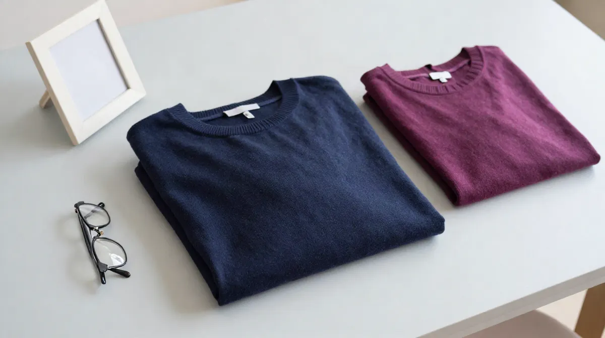
- Wear a solid color that is clearly darker than white: navy, a mid blue, green, burgundy or plum.
- Avoid white, cream and very light tops. They can blend into the light background.
- Choose a plain top with a simple neckline. Busy prints and big logos pull the eye away from your face.
- Keep jewelry small, and keep your hair off your face.
- Check the photo rules of your own country before you go. They differ, and they change.
Check the rules for your passport
Each country sets its own photo rules. For a UK passport, gov.uk asks for a plain light background on a digital photo, and a plain cream or light gray background on a printed one. It asks for no glasses unless you must wear them, and no head covering unless it is for religious or medical reasons (read on gov.uk, 2026-10-29).
For a US passport, read the photo page of the U.S. Department of State at travel.state.gov before you go. A pharmacy or post office that takes passport photos can also tell you the current rules.
Why the color of your top matters
Two things happen in a passport photo. The background is light, so a light top merges with it and your outline fades. And the top sits right under your face, in flat, even light, for as long as the passport lasts. A mid to deep color from your own palette fixes both: it stands out from the background, and it is a color that suits your skin.
The best colors for your passport photo, by season
Three colors from each season's palette that are deep enough to stand out from a light background. The skip line names the light shades in that palette to keep for another day.
Stands out on a light background
- Soft denim navy#5C6B8A
- Light taupe#9E8C74
- Cornflower#5FAEDB
Skip: peach, blossom pink, buttercup, golden cream and 8 more.
Stands out on a light background
- Bright tangerine#F4511E
- Warm pink#EC407A
- Warm violet#7E57C2
Skip: daffodil, peach blossom, cream.
Stands out on a light background
- Bright violet#651FFF
- Bright orange#FF3D00
- Hot pink#FF4081
Skip: vivid gold, lemon, bright lime, electric turquoise and 4 more.
Stands out on a light background
- Soft raspberry#C2739A
- Soft denim#6C97BF
- Soft plum#8E7C9E
Skip: powder pink, soft jade, pale citron, soft butter and 4 more.
Stands out on a light background
- Rose red#D81B60
- Cool lavender#9575CD
- Teal blue#4A8FA8
Skip: pale rose, soft white.
Stands out on a light background
- Soft berry#A5677A
- Dusty lilac#8E7C9E
- Slate blue#6E8CA0
Skip: oat, pale dusty pink, soft white.
Stands out on a light background
- Muted rust#B5654A
- Sage green#87905F
- Soft mulberry#A86F7E
Skip: soft cream.
Stands out on a light background
- Rust#C1440E
- Olive#808000
- Warm plum#A0637C
Skip: warm cream.
Stands out on a light background
- Deep amber#B9770E
- Tomato red#A93226
- Deep plum#6C3483
Skip: warm cream.
Stands out on a light background
- True red#B71C1C
- Sapphire#0D47A1
- Magenta wine#880E4F
Skip: icy blue, icy lavender, icy pink, icy aqua and 2 more.
Stands out on a light background
- Vivid purple#AA00FF
- True red#D50000
- Cool fuchsia#C51162
Skip: icy blue, icy lilac, icy pink, icy aqua and 3 more.
Stands out on a light background
- Bright violet#651FFF
- Electric red#FF1744
- Vivid azure#2979FF
Skip: electric turquoise, bright aqua, vivid green, bright lime and 6 more.
Planning a group photo instead? See the best colors for family pictures. Other dress codes, the same idea: what to wear to a funeral and wedding guest colors.
How we picked the colors
Each season card reads that season's own palette and neutrals on this site, 300 named colors across the 12 seasons, measured in CIELAB: lightness (L*), chroma (C*, how strong the color is) and hue angle. A shade is on the card when it is mid to deep (L* 25 to 62) with some color (C* 15 or more), 35° of hue apart. Those stay clear of a white, cream or light gray background. A season with fewer than three gets its next darkest shades up to L* 70.
The skip line lists every light shade (L* 80 or more), which can blend into a light background. Where a palette has too few shades that far apart in hue, the gap narrows to half, then to 12°. No color is typed by hand, and no brand or store is used. The same rule runs on every season, so two cards can be compared.
What this page cannot do
This page cannot check your photo against the rules of your country, and it cannot tell you which season you are. The official photo page of your passport office decides what is allowed. Our free analysis reads your season from one selfie, in your browser, and gives you your own palette.
How this is different from other color analysis tools
- 01
Your photo stays on your device
Many photo apps upload your selfie and read it on their server (see our comparison). Ours measures it in your browser. There is no upload.
- 02
The result is free
Your season and palette, with no account and no email. At least one app in our comparison takes payment before you see any result.
- 03
A close call says so
Every result names the runner-up season and how close the call was. Borderline is a result we print.
- 04
We publish our accuracy
We tuned the method on faces that experts had labelled by season, then tested it on 410 celebrity photos we collected. The results, misses included.
Questions
What color should I wear for a passport photo?
A solid color that is clearly darker than the light background. Navy, a mid blue, green, burgundy and plum all work. The best one is a mid to deep shade from your own color season.
Can I wear white in a passport photo?
It is better not to. Passport photos use a plain light background, and a white top can blend into it, so the outline of your shoulders fades.
Can I wear black in a passport photo?
Yes, black stands out well from a light background. If black looks harsh on you, a navy or another deep color from your own palette is a softer choice.
Which colors suit a light or a deep coloring in a passport photo?
Pick from your own season. For example, a Light Summer can wear soft raspberry, soft denim, soft plum, and a Deep Autumn deep amber, tomato red, deep plum. This page lists three for each of the 12 seasons.
What you can do on this page
This page gives practical advice on what to wear for a passport photo: a solid, mid to dark top that stands out from a light background, no white, no busy prints, small jewelry. It summarizes the UK photo rules as read on gov.uk and sends US readers to the State Department photo page. It then lists, for each of the 12 color seasons, three shades from that season's palette that stay clear of a light background, with hex codes, picked by a stated CIELAB rule, and the light shades to skip. The free photo analysis finds a season from one selfie in the browser, with no upload and no account.