Pastel color palette: 25 pastel colors, with hex codes
Every pastel in our 12 seasonal color palettes, from peach blossom to warm rose. Tap a color to copy its hex code. Below the list: which pastels suit which season, and what to wear them with.
By Jane MitchellCertified color analystPublished
All 25 pastel colors, with hex codes
In color order. The line under each name says how many of the 12 seasons wear it.
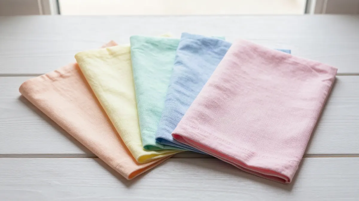
Which pastel colors suit you
The pastel shades in each season's palette, most first. The neutral beside each is one from the same season to wear with them.
Light Spring 9 shades
melon, peach, light chartreuse, mint and light turquoise and 4 more. Wear with ivory (#F6EFE2).
Light Summer 8 shades
soft butter, pale citron, soft sage, soft jade and sea glass and 3 more. Wear with blue gray (#7C8894).
Deep Winter 4 shades
icy aqua, icy blue, icy lavender and icy pink. Wear with true black (#1C1C1C).
Bright Winter 4 shades
electric turquoise, icy blue, icy lavender and icy pink. Wear with true black (#212121).
True Winter 3 shades
icy blue, icy lavender and icy pink. Wear with true black (#000000).
True Spring 2 shades
peach blossom and aqua. Wear with warm mushroom (#A1887F).
Bright Spring 1 shade
electric turquoise. Wear with dark warm brown (#3E2723).
True Summer 1 shade
soft orchid. Wear with blue gray (#5A6B7C).
4 seasons have no pastel by our rule. That is data, not a gap: those palettes do not use pastel.
Warm and cool pastels
A pastel is warm or cool by the seasons that wear it: Springs and Autumns are warm, Summers and Winters cool.
Warm only (11)
- Peach blossom#FFCCBC
- Melon#FFC2A8
- Peach#FFB68F
- Light chartreuse#F2E08E
- Mint#A8E6CF
- Light turquoise#6FD8D0
Cool only (13)
- Soft butter#F0E1B8
- Pale citron#D6D9A8
- Soft sage#B7CDA6
- Soft jade#A8CFC4
- Icy aqua#B2DFDB
- Sea glass#9CC8D6
Worn by both (1)
- Electric turquoise#00E5FF
Pastel outfit ideas
Three outfits, one from each of the seasons that hold the most of this color: a main piece, a second color and a neutral, all from that season's own palette.
Light Spring
Orchid as the main piece, light chartreuse as the second color, ivory for shoes and bag.
Light Summer
Dusty rose as the main piece, soft butter as the second color, blue gray for shoes and bag.
Deep Winter
Icy lavender as the main piece, icy blue as the second color, true black for shoes and bag.
Using this pastel palette for a design
For a website, a room or a brand, copy the hex codes from the list above. The shades of one season already work together, so a set taken from one season card reads as a planned palette. For a calmer base, add shades from the pink color palette or the purple color palette. To see one of these colors next to every other color, use colors that go with every color. For ready combinations, see three colors that look good together.
How we picked the shades
We pooled the wearable palette and the neutrals of all 12 seasons on this site, 271 different colors, and measured each in CIELAB: lightness (L*), chroma (C*, how strong the color is) and hue angle. A shade is in this palette when it is light (L* 75 or more) with a soft but clear color (C* from 14 to 45), any hue. A shade named beige, cream, oat, wheat, sand or tan stays with the neutrals.
No shade is typed by hand, and no paint or fashion brand is used. The same shade can be in two palettes, for example a light pink in both the pink and the pastel palette.
What this page cannot do
This page shows which seasons wear each pastel. It cannot tell you which season you are: that depends on your own skin, hair and eyes, in good light. Our free analysis reads them from one selfie, in your browser, and gives you your own palette with every pastel that suits you.
How this is different from other color analysis tools
- 01
Your photo stays on your device
Many photo apps upload your selfie and read it on their server (see our comparison). Ours measures it in your browser. There is no upload.
- 02
The result is free
Your season and palette, with no account and no email. At least one app in our comparison takes payment before you see any result.
- 03
A close call says so
Every result names the runner-up season and how close the call was. Borderline is a result we print.
- 04
We publish our accuracy
We tuned the method on faces that experts had labelled by season, then tested it on 410 celebrity photos we collected. The results, misses included.
Questions
What colors are in a pastel color palette?
Our pastel color palette holds 25 shades from the 12 seasonal palettes, among them peach blossom, melon, peach, soft butter, light chartreuse and pale citron. Each one has its hex code on this page.
Which color season looks best in pastel?
Light Spring holds the most pastel shades of the 12 seasons (9), followed by Light Summer (8) and Deep Winter (4). By family, Spring leads. 4 of the 12 seasons have no pastel shade by our rule.
What colors go with pastel?
Each season pairs its pastels with its own neutrals. For Light Spring that is ivory. For a design, pink and purple shades from the same seasons sit well beside it.
What are the hex codes for pastel colors?
For example peach blossom #FFCCBC, melon #FFC2A8, peach #FFB68F, soft butter #F0E1B8 and light chartreuse #F2E08E. All 25 are listed at the top of this page, and one tap copies a code.
What you can do on this page
This page is a pastel color palette of 25 named shades, each with its hex code and a one-tap copy, taken from the 12 seasonal color palettes on this site by a stated CIELAB rule. It shows which pastels each season wears with a neutral to pair, splits the shades into warm, cool and both, and builds three outfits from the seasons that hold the most. The free photo analysis finds a season from one selfie in the browser, with no upload and no account.
More on color palettes
Part of the Color Analysis Encyclopedia: every article on color palettes.